Active Addresses vs. Active Deposits - Which Assets are Seeing Nice Upticks?

We recently posted about Ethereum's return above $2,000 this past week, and our explanation on one of the key contributors to why.

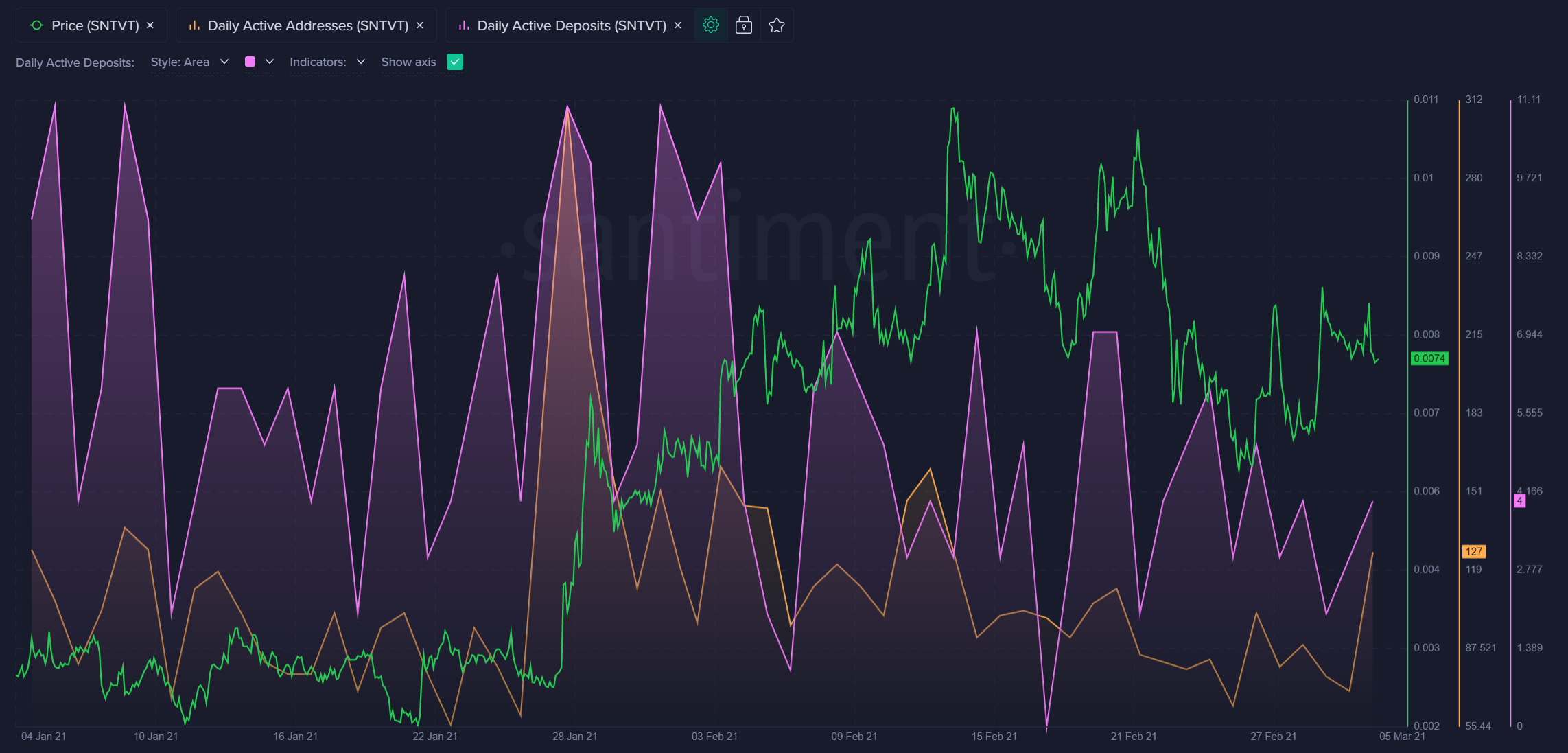
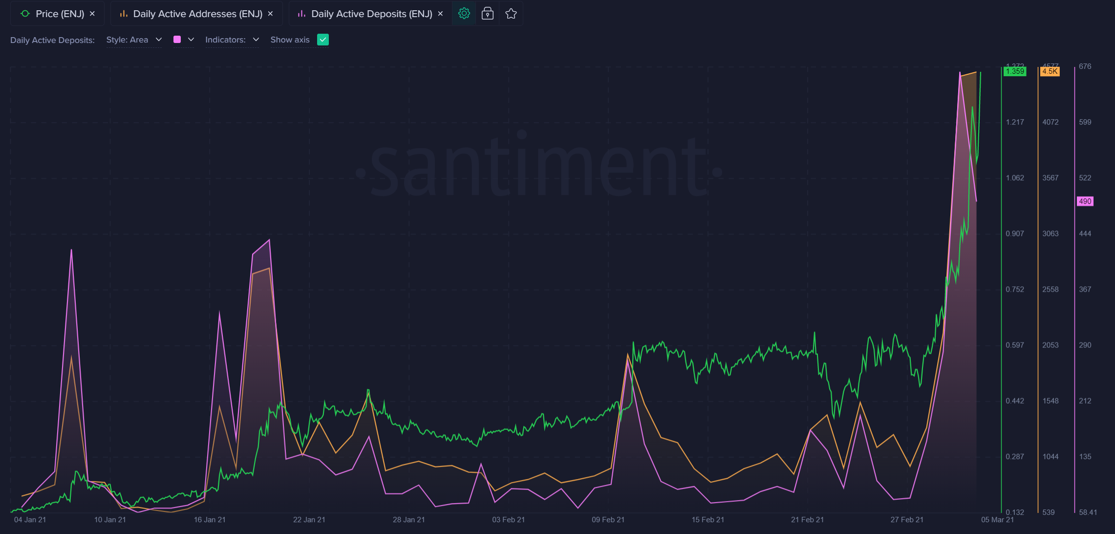
When active addresses move up over time for a crypto asset, while active deposits move down, it's a reliable indication of a token seeing growing utility without funds moving to exchanges for potential sell-offs. In other words, this is a very bullish pattern our pro traders look for often.
Our new Daily Active Deposits & Non-Deposit Activity Sansheets Model easily identifies which assets are developing patterns similar to Ethereum's. Here's a snapshot of which activity vs. deposit ratios are rising vs. their 3-month resting averages:

Here are some of the largest bullish divergences, according to this model. We look for high green bars (indicating large activity/deposit ratios), and large green dots on the above model, and rising orange lines on Sanbase here:
Skale ($SKL)

Enjin Coin ($ENJ)
Decentraland ($MANA)

Matic ($MATIC)

Sentivate ($SNTVT)